By playing the immersion rather than the rupture, they dialogued with the place to reveal its singularity: the grain.


Imagining the graphic identity of a place is a delicate exercise that lies between seduction and evocation, between concision and communication. Aware of these challenges, the ambition of Anne Piscaglia and Guillaume Bullat of the Voiture 14 studio was to follow the graphic codes already established for the Pinault Collection project at the Bourse de Commerce, while developing a singular universe.

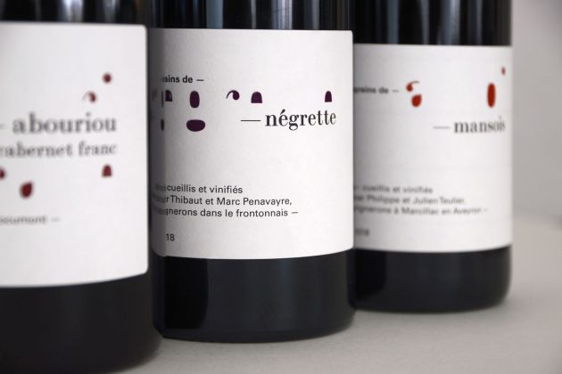
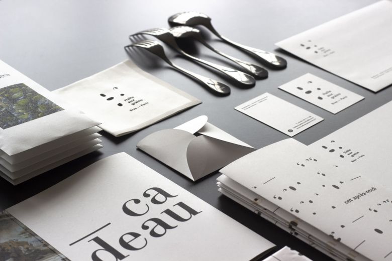
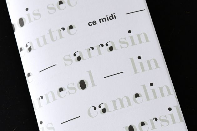
Then it was a matter of dialoguing with the place, revealing the singularity of the restaurant: the grain. Words and their typography were the graphic designers' breeding ground. They first harvested the vocabulary of Michel and Sébastien Bras' culinary repertoire of grains: oats, fennel, spelt, azuki, fenugreek, mustard... Then, they patiently pruned the letters to collect here the eye of an o, the accent of an e, the punctuation of an i, there, the tear of a g, the stalk of an r. Between counter-forms and typographic refinements came to life this surprising grain library that became a graphic system. First applied to the word "grain", the germinations revealed drew the logo of the restaurant. "We had the impression of going back to the genesis of the formation of each letter," the designers said.

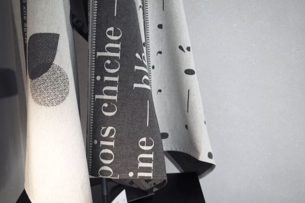
A discreet and infinite universe is declined, scattered in dotted, punched, printed, woven, embroidered, pixelated. This grain library settles in the landscape, adorns the bottles of the "grains" vintage and the menus, animates the pages of the website, takes place on the tableware and the jackets of the cooks who proudly display this plant coat of arms. The graphic designers have been working together to design this exercise, under the watchful eyes of Michel and Sébastien Bras, with whom they have been collaborating for many years.
